Free icons for shadcn/ui, four styles, two corners
Every drawing follows the same rules, so two icons picked months apart still look like they belong together.
7,702 downloads on npm, 1,093 in the last week (opens in a new tab)1,114 icons, all drawn on the same 24×24 grid.
4 weights per drawing: stroke, two-tone, duotone and fill, each cut rounded or sharp. 8,912 files in all.
Free under the MIT License, in commercial work as much as personal.
Stroke, two-tone, duotone and fill
Stroke is the drawing; the other two are derived from it, and every one of them is cut both rounded and sharp. A family stays recognisable whichever weight a surface calls for.
stroke
1,114 iconsThe full set, and the drawing every other style is derived from. 2px keylines on a 24 grid.
two-tone
1,114 iconsThe same keylines over a flat plate at reduced opacity, for surfaces that need weight without going solid.
duotone
1,114 iconsNo outline: a grey body with the detail in black, so the part that matters reads first.
fill
1,114 iconsSolid, with the detail knocked back out of the shape rather than drawn on top of it.
Square and circle containers
125 of the 1,114 icons have one. The container wraps the base drawing rather than replacing it, so swapping forms changes the emphasis and nothing else.
Request sent
Your ticket is logged. We will reply by email within a day.
check is the drawing with nothing around it, which is what lets it grow. At 56px on a confirmation screen it is the whole message, and at 16 it slips into a row of text without interrupting it.
square-check is that same tick inside a container, which gives it the weight to lead a row rather than end one. Nothing about the tick changes.
Preferences
Display name
Changes saved
Your settings are up to date.
circle-check is the third form. A circle reads softer than a square at the same size, which is why it is the one that ends up in confirmations.
Rounded and sharp corners
All 1,114 drawings are cut both ways, in every weight they carry, so this is a switch over the set rather than a second set beside it.
Rounded is the drawing as the set is built. Every corner takes a radius off one ladder and every stroke ends round, which is what stops a glyph reading as brittle at the size it ships at.
Sharp squares every one of them. Same drawing, same 24×24 box, same name on disk, so nothing in a layout moves when you swap one for the other.
Works in your stack
React and React Native components generated from the same files as the SVGs, plus Vue and Svelte through Iconify.
# Every icon, as React components
npm i @keyline-icons/react
# Or copy one drawing in, with nothing left in your lockfile
npx @keyline-icons/cli add bellimport { Bell, Check, Search } from "@keyline-icons/react"
<Bell className="size-4" />
<Check size={16} />
<Search strokeWidth={1.5} />Or skip the install entirely: every icon in the browser copies as plain SVG that works in any framework, or none. Beyond the four above, the whole set is on Iconify as keyline-icons, which covers Solid, Angular and plain web components. How to install.
Design files
The set is drawn in Figma: one component set per icon, and an export step that changes nothing about the drawing. What ships here is what is in the file.
Opens the Figma Community listing, in Figma or the browser.
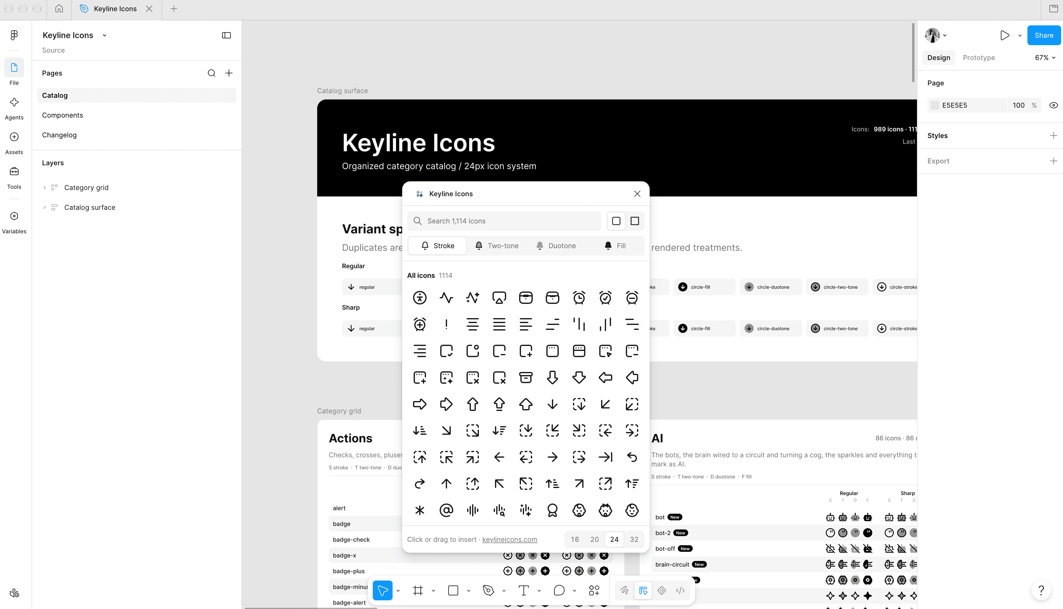
The same search, one more place
A query is ranked the way the CLI and the MCP server rank it: exact name, then prefix, then word, then a word someone curated in Figma. Four surfaces, one vocabulary.
Click it in, or drag it there
A click centres it in the frame you have selected; a drag lands it where you let go. Either way at 16, 20, 24 or 32, with the line scaled to match, and currentColor swapped for real ink, because Figma’s importer cannot resolve it.
Figma and FigJam both
The same plugin in both editors. An insert becomes a group in FigJam rather than a frame, which is what makes recolouring it there land on the drawing instead of on a wrapper.
It reads the published set
The icons and the shelves they sit on come over the network from this repository, not from the plugin’s own bundle, so a release reaches everyone without a plugin update.
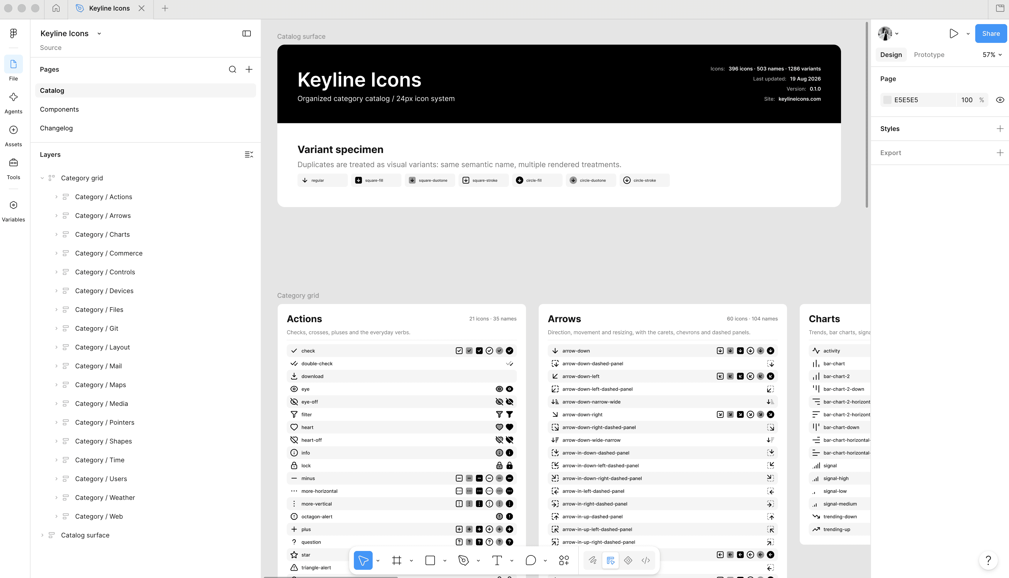
One component set per icon
Three variant properties on it, Container, Style and Corners, and nothing else. The names in Figma are the names on disk.
Exports land untouched
raw/ holds what came out of Figma, one file per variant, under the name Figma gives it: Container=circle, Style=duotone, Corners=sharp.svg.
Search words come from the file
Each set’s own description in Figma is the alias list the browser searches, baked out by the keyword step rather than kept in a second table.
Checked against the repository
icons:figma hashes every segment of every variant in the file and diffs it against raw/. Twelve blank phones were found that way.
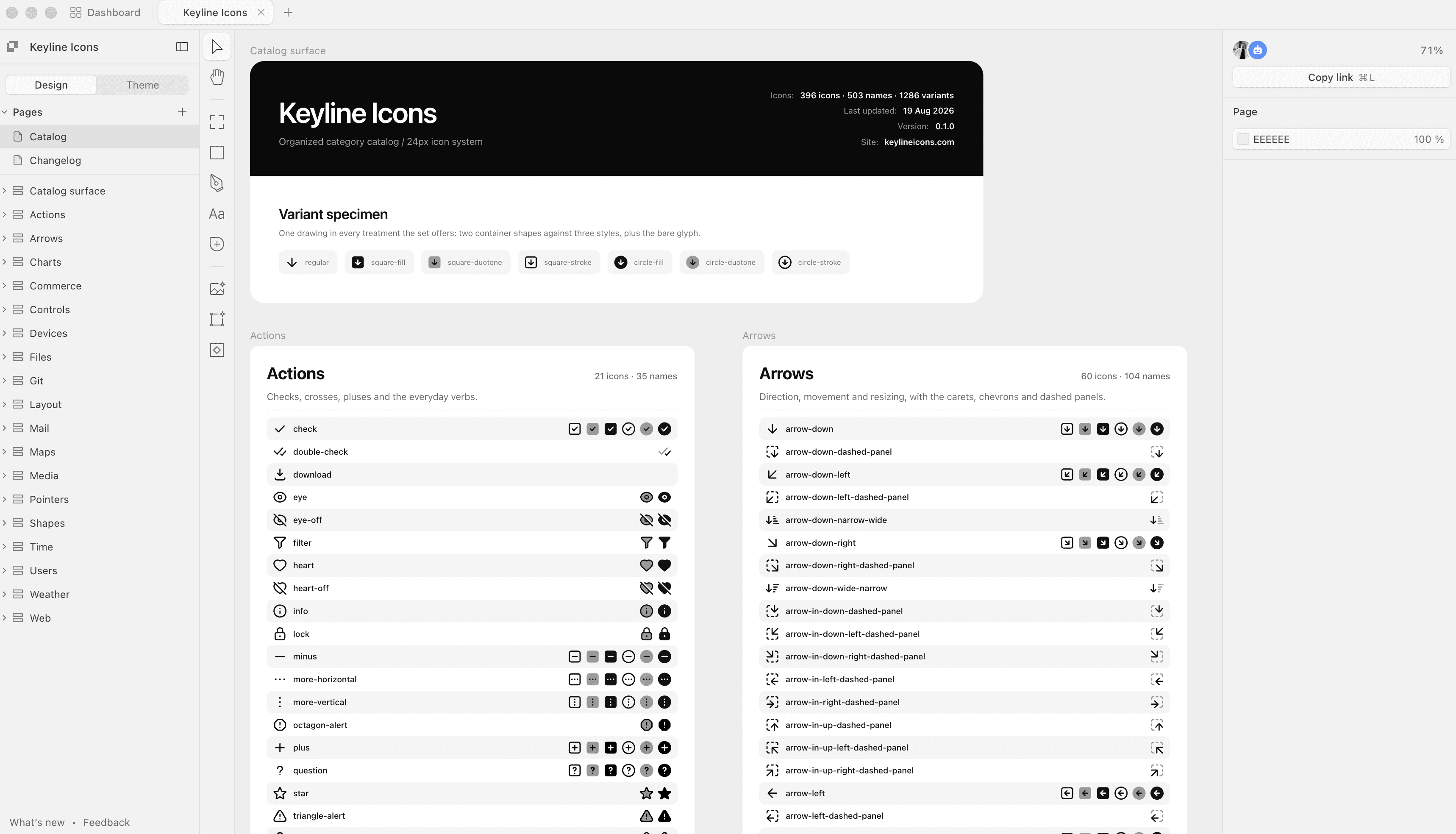
One artboard per category
The canvas is the catalogue: a board per section, split across a few when a section carries more drawings than one board should, and across two files because one file is more than Paper will hold.
Layers carry the icon's name
Every drawing is named in the layer tree the way it is named on disk, down to the variant: circle-check duotone.
Generated, not redrawn
paper:build composes the whole set out of icons/, so the Paper file is downstream of the same drawings the packages ship.
The sheets are checked in CI
paper:check re-composes them and fails on any difference, so what the file was built from cannot go stale without the build saying so.
See it in a real interface
A grid of icons flatters every set. These are the pages that do not: a full shadcn dashboard and a set of phone screens, drawn entirely with the library at the sizes it ships at.
FAQ
The questions asked before taking a set: what it covers, what it costs, and what it works with.
- What is Keyline Icons?
- A free icon set: 1,114 icons drawn on one 24×24 grid, each in four styles: stroke, two-tone, duotone and fill, with rounded or sharp corners. Built for shadcn/ui, released under the MIT License.
- How many icons are there, and what are the four styles?
- 1,114 stroke, 1,114 two-tone, 1,114 duotone, 1,114 fill, each cut with rounded and with sharp corners, so 8,912 SVGs in total. Stroke is the drawing the others start from. Two-tone keeps that outline over a 40% plate, which is what duotone meant until 0.9.0. Duotone drops the outline and puts the part that matters in black over a grey body. Fill is solid. Since 1.0.0 every name comes in all four.
- Are the icons free to use in commercial projects?
- Yes. The set is released under the MIT License, which covers commercial work, client work and products you sell, with no per-seat terms and no subscription. The LICENSE file in the repository is the actual grant and governs.
- Do these work with shadcn/ui?
- That is what they are drawn for. The set uses the same 24×24 box and the same 2px keyline that shadcn/ui's defaults assume, so an icon lands correctly at size-4 inside a Button with no adjustment to your components. This whole site is built with them, which is the same claim tested end to end rather than asserted.
- Do I have to install anything?
- Not to use one icon. Open any drawing in the browser and take it as SVG or JSX, at whatever size and stroke width you have set, then paste it into a component. For the whole set as React components there is @keyline-icons/react, one component per icon generated from the same files, and the install page covers how to get it.
- Why do some icons come in square and circle versions?
- Because a container is a different icon, not a style of one: 60 of the 1,114 drawings come in a square- form and 65 in a circle-, wrapping the base glyph rather than replacing it. The container also gives a glyph the enclosed area a duotone or a fill needs, which is why a boxed variant can show a glyph solid that the bare drawing only outlines.
- What is the difference between the rounded and sharp icons?
- Only the corners and the stroke caps. All 1,114 drawings are cut both ways, in every weight they carry, so the two are one set with a switch on it rather than two sets: same names, same 24×24 grid, same coverage in stroke, two-tone, duotone and fill. Rounded takes a radius off one ladder at every corner and ends each stroke round; sharp takes every corner to a true point and squares every cap. The ink reaches exactly as far either way, so nothing in a layout moves when you swap one for the other.
- Is there a Figma file?
- The set is drawn in one Figma file, as a component set per icon with three variant properties on it: Container, Style and Corners. What is public today is the repository at github.com/keyline-icons/keyline-icons: raw/ holds the export of every variant straight out of Figma, under the name Figma gives it, and icons/ holds the normalised SVGs the site, the React components and the packages are all built from.
More on installing, importing and switching from another set: How to install.
Keep the set free: sponsorship is what pays for the hours the next hundred take.
Become a sponsor (opens in a new tab)Sponsors